Objective
Modernize the email series to improve clarity, usability, and visual appeal while ensuring alignment with brand standards. Design should be flexible to support multiple brand messages.
Key Words
Clear, Professional, Engagement, Human, Connection, Career-Focused
The Process
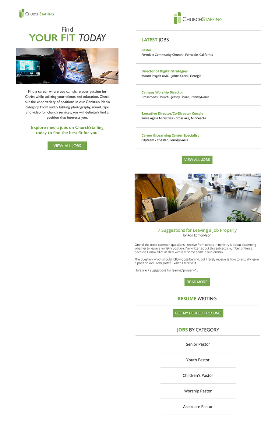
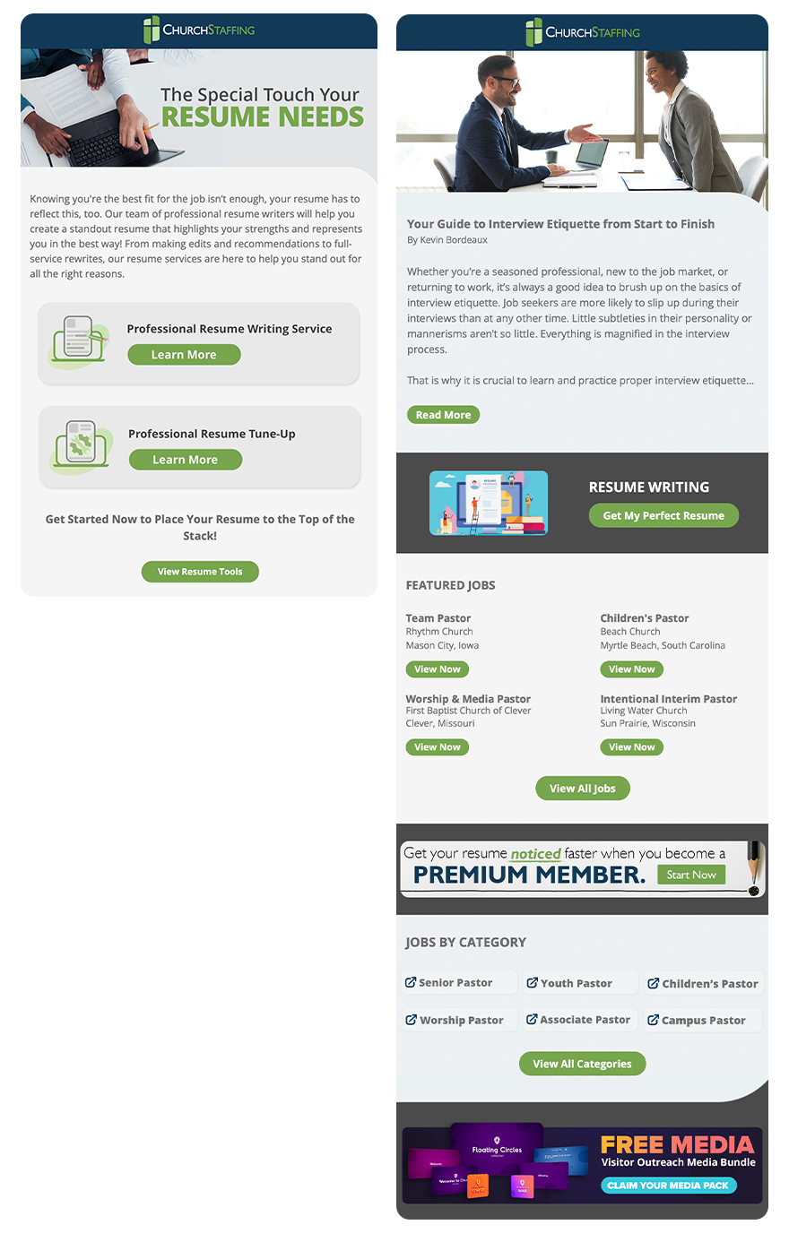
To better understand the target group, I started by researching industry trends and competitors. The next step was to clarify the tone by creating a mood board. Using key words is the perfect way to accomplish this. After some great collaboration with the brand managers, the final redesigned email series delivered an updated modern design that reinforced brand trust and user connection. The CTR (click through rate) more than doubled after the new designs were implemented.
Color
I chose to stay with the brand’s color palette to preserve recognition and reinforce trust. The blues communicate stability and professionalism, while the greens introduce a sense of growth and opportunity.