Objective
Design a cohesive brand experience for an upscale Thai street food restaurant, including a logo, food photography, and a menu layout.
Process – Logo
The goal for the logo was to use the loose and raw feel of street food with a modern, minimal aesthetic. I began with researching street food culture in Thailand and knew immediately I wanted the logo to incorporate the traditional food cart. The steaming bowl in the middle conveys the warmth and comfort of homemade food while the hanging sign displays the name, Ya Ya’s, in Thai script.
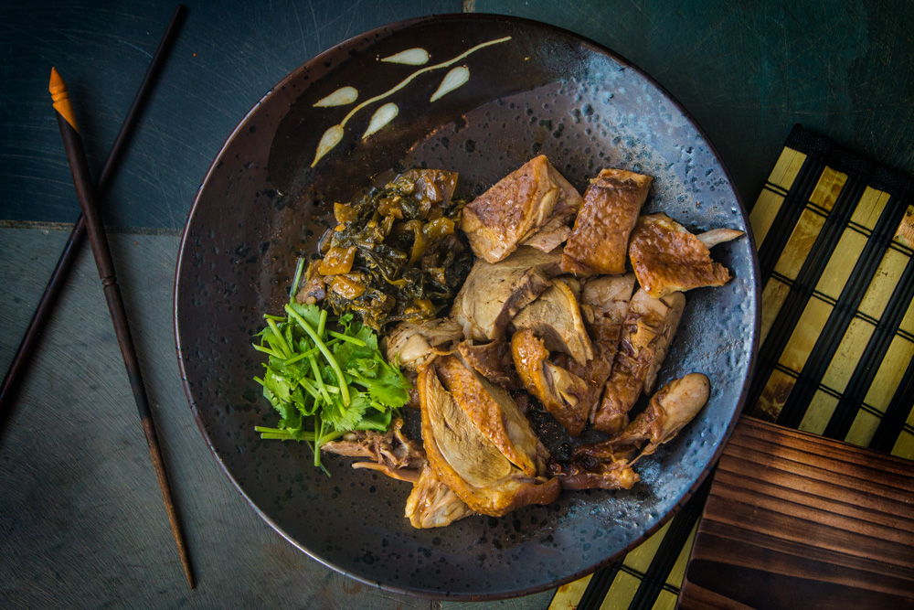
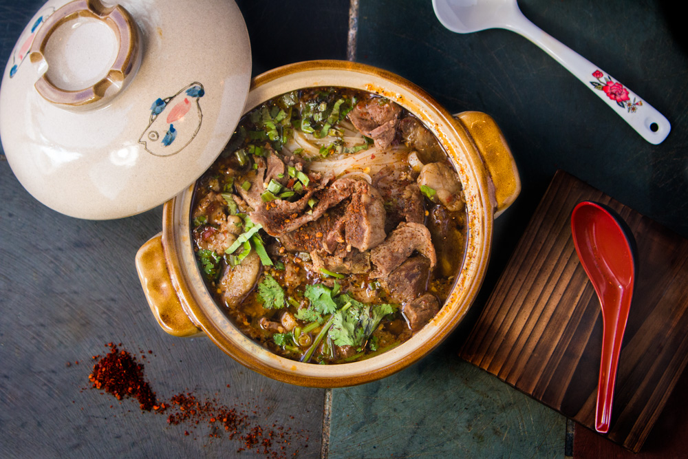
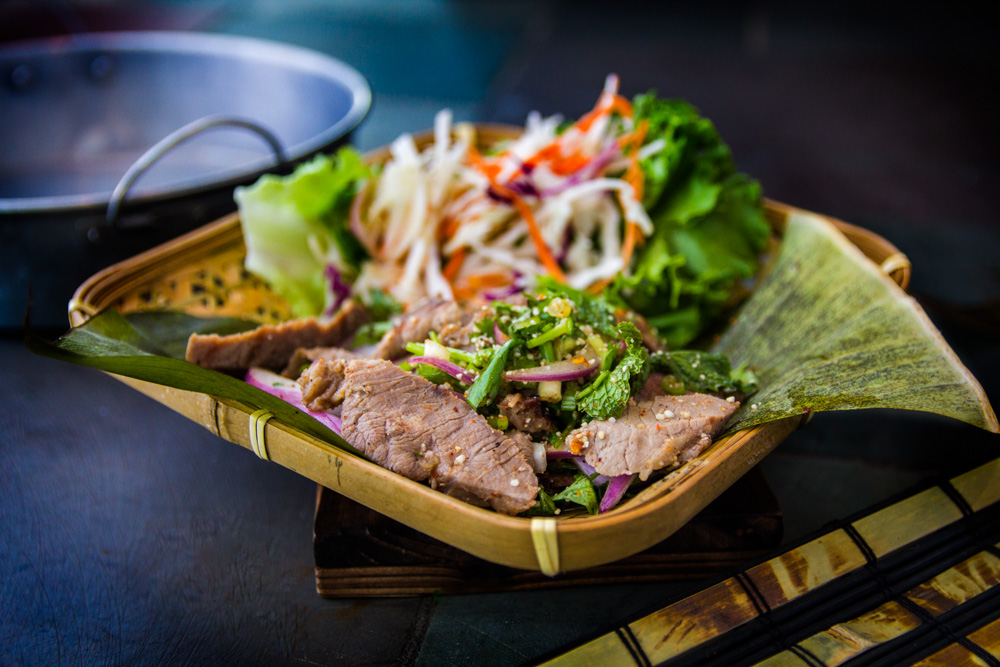
Process – Photography
For the photography, I wanted to capture the rustic authentic feel of street food, while subtly
connecting the customer to the restaurant. I used the stone tiles of the restaurant’s interior to
ground the imagery incorporating their tones and textures to complement the dishes. The grey-blue tones setoff the browns and vibrant greens of the food. The supporting elements within the composition helped maintain the Asian aesthetics while presenting the dishes in a fresh, unique way that stands out from the typical Asian restaurant photography.
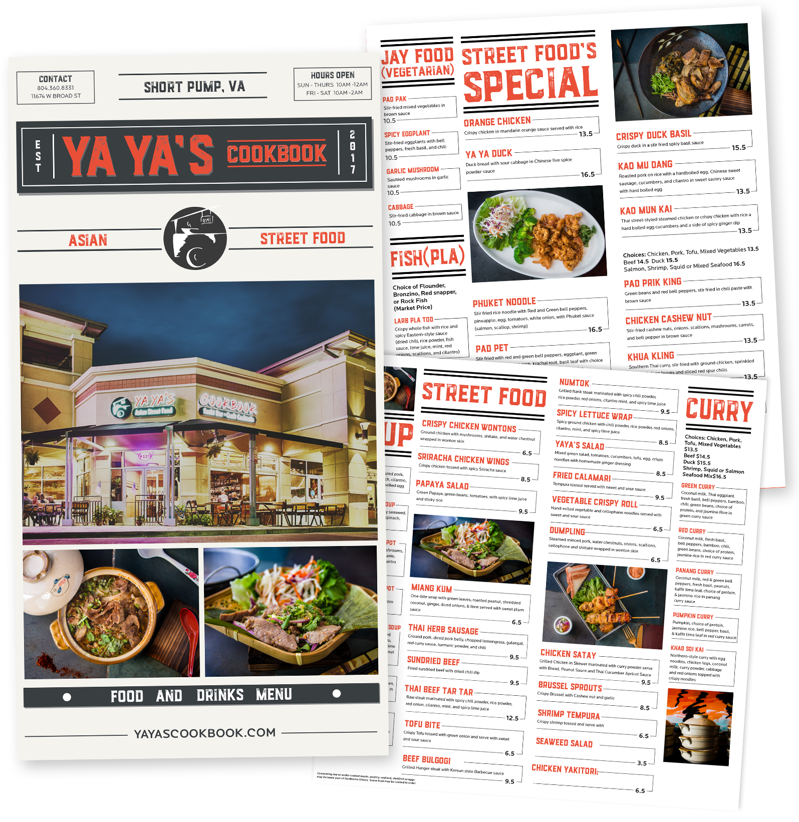
Process – Menu
The concept for the menu design was inspired by the layout of newspapers. I began by researching various newspaper designs, paying close attention to how headlines, articles, and images were arranged on the page. From this research, I drew inspiration from key visual elements such as bold headline typography, text wrapping around imagery, and the use of multi-column layouts.
To keep it looking contemporary, I paired a weathered slab-serif font with an easy-to-read sans-serif.
The colors draw from a traditional black and white newspaper style with a slight blue-grey undertone to give it that sophisticated modern look, complimented with a red-leaning orange to really grab attention. This combination reinforces the newspaper aesthetic while keeping to street food culture.